

Data Visualization for Back Office App
As part of my role leading UX research and end-to-end design for Modere’s internal Back Office mobile app, I was tasked with designing new ways of visualizing the data for the new social media tracking features for our Social Marketers (SMs)—independent sellers who needed real-time business insights on the go.
December 2022 - February 2025
Major Stakeholders
Modere Sales
Social Marketers (SMs, Direct Sellers)
Tools Used
Adobe XD, Microsoft Whiteboard, SwiftUI, Zoom, Survey Monkey, Google Analytics
My Role
End-to-end Product Design
UX, UI, Usability, Remote UX Research, Competitive Analysis, Collaboration, Information Visualization
This project was conducted with a team that spanned many departments in the company as well as a third-party contractor. Credit for the following work is shared among all contributors involved.
Problem to Solve
Social Marketers used multiple tools to understand their performance, often jumping between platforms like Instagram insights, Modere’s legacy desktop reporting, and spreadsheets.
Our goal was to consolidate that insight into the mobile app with visual cards that were:
Glanceable
Actionable
Easy to understand across experience levels
However, visualizing this data clearly (especially on small screens) was a major design challenge.
Power BI as a Design Sandbox
While designing these cards, I used Power BI to prototype and test different visual design and data combinations before bringing them into Figma.
This allowed me to:
Simulate real data patterns from mock social cart activity
Experiment with visual density and component layout
Test interactivity ideas (like drill-downs or hover states)
Share realistic visuals with stakeholders to gather early feedback
Power BI served as a functional sketchpad, letting me play with:
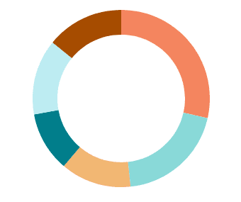
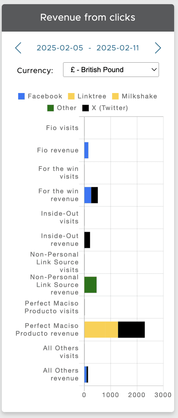
Bar vs. pie charts for “Earnings by Source”
Time-series graphs for “Revenue by Date”
Tooltips and labels that mirrored eventual UX microcopy


Design Decisions & Testing
I used Power BI to test visual formats and data clarity across all cards.
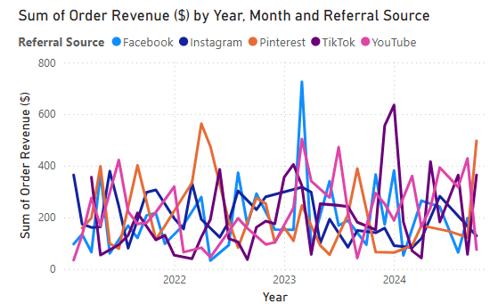
A line graph made “Revenue by Date” easier to interpret over time, especially for spotting trends.
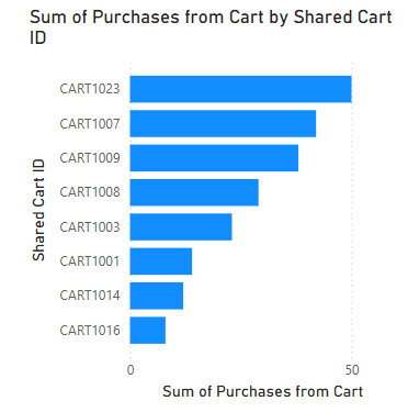
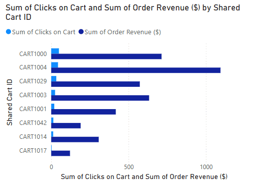
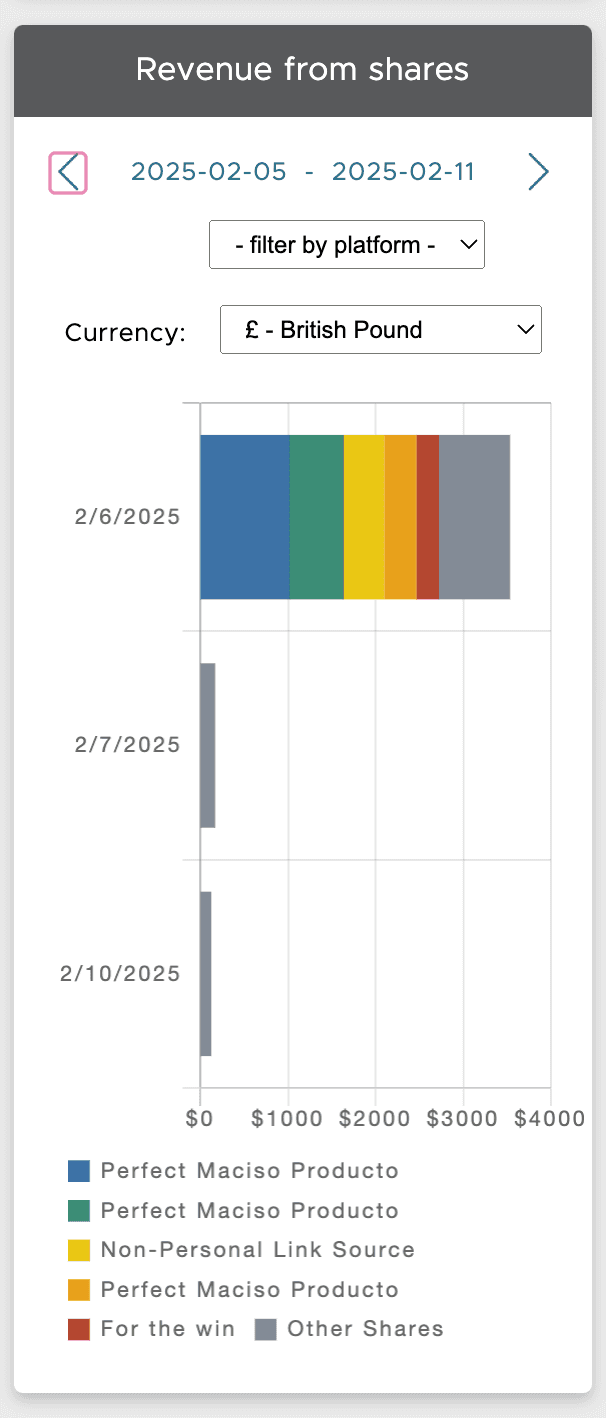
Horizontal bar charts worked best for “Revenue from Clicks,” “Purchases from Shares,” and “Revenue from Shares” because they clearly showed performance differences across shared carts or campaigns and fit better on narrow mobile screens, improving readability and tap targets.


Collaboration & Constraints
I regularly demoed my Power BI visual mockups to internal devs, our third-party engineering team, and product leadership. Since our MVP had to work with existing APIs, I flagged where visualizations would show limited data and designed empty/error states accordingly.
These early Power BI prototypes also helped secure stakeholder buy-in, showing not just what data we could present, but how it could support better decision-making for our SMs.
Outcomes
While the company unfortunately closed before launch, these design exercises significantly shaped how I approach data visualization, mobile UI design, and cross-functional communication, especially when working with tech and scope constraints.
Key Takeaways:
Power BI was an unexpected but powerful design tool. Great for simulating real-world data scenarios before committing to Figma mockups.
Visualizing complex data helped me think through edge cases early, improving my ability to design responsive and modular visual components.
Presenting ideal-state concepts, even if technically out of reach at first, helped rally stakeholders around a long-term vision and shaped our prioritization conversations.
Special shout out to my amazing team who worked so hard to make this project a success!


