

E-Commerce Website Replatform
Modere’s e-commerce site was running on a custom-built platform that had become increasingly unstable and costly to maintain. The checkout process, in particular, was plagued by technical issues that frustrated users and caused high cart abandonment rates.
The goal was to migrate the entire shopping experience to BigCommerce, a proven platform with robust checkout capabilities, while improving the user journey, modernizing the visual design, and ensuring a smooth transition for both customers and internal teams.
July 2022 - June 2024

Before

After
Major Stakeholders
Modere
Social Marketers (SMs, Direct Sellers)
Customers
Tools Used
Figma, Adobe XD, Zepline, Magicul, Google Analytics, Big Commerce, MobiLoud, Exigo, Azure DevOps, Aha!, Jira, Smartsheet
My Role
UX, UI, Usability, Remote UX Research, Content Migration, QA, Branding and Styling
This project was a company wide collaboration and effort along with at least four other third-party companies. Credit for the following work is shared among all contributors involved.
My Main Contributions
As the company’s only UX designer, I led the design effort from end to end.
My responsibilities included:
Conducting UX research to identify pain points and opportunities
Designing page layouts, features, and shopping workflows
Creating wireframes, interactive prototypes, and QA documentation
Managing content migration and ensuring brand consistency
Partnering closely with product managers, marketing, IT, and external vendors such as Guidance and BigCommerce to align on requirements, resolve blockers, and ensure a cohesive experience
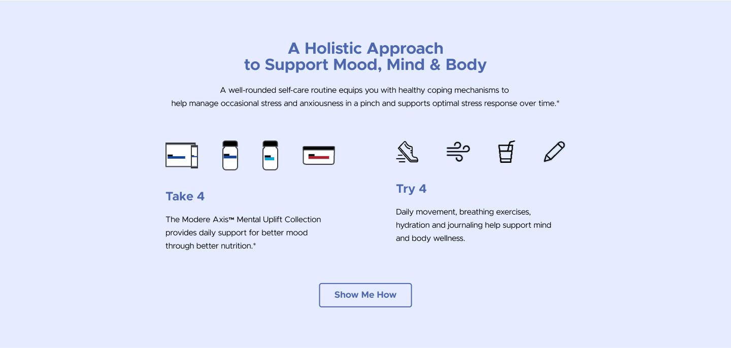
Goals & Success Metrics
The replatform project had several core objectives from the start:
Improve checkout conversion and reduce cart abandonment
Modernize the UI to create a more engaging and trustworthy shopping experience
Boost site performance for faster load times and smoother navigation
Simplify maintenance by moving to a stable, scalable e-commerce platform
Enhance mobile usability and ensure ADA compliance
Largest Roadblocks
Initially scoped as a straightforward lift-and-shift migration, the project quickly evolved when stakeholders realized the opportunity to completely restructure and redesign the site.
Midway through, leadership also prioritized the launch of a new U.S. subscription program, which I had previously designed.
Managing overlapping initiatives with shifting requirements required careful tracking, rapid communication, and the ability to make real-time design updates.
Research & Discovery
To guide the replatform, I combined both existing data and new research, using analytics reviews, usability testing, surveys, interviews, and competitive analysis.
This helped uncover key pain points and informed design decisions that would improve the overall shopping experience.
Key Findings:
- Search Functionality
The old site’s search required exact product name matches and prioritized collections over individual products, which frustrated users, especially direct sellers.
We redesigned search to surface more relevant results at the top, restoring its value as a quick navigation tool.


- Product Variants and Catalog
Adding product variants, such as flavors, on product pages and creating parent products for collections decluttered catalog pages and simplified browsing.


- Checkout
Migrating to BigCommerce resolved many back-end issues, and adding Google Pay and Venmo enabled a smoother checkout experience for 74% more mobile users.
- CMS Landing Pages with Block Templates
Previously, static pages were hand-built for each product launch.
I distilled all existing sections into 11 reusable block types, with only 4 unique exceptions, and created wireframes to accelerate content migration and future page creation.
Click here to view the block template designs.

Block
Implementation
User Segments
I designed for multiple audiences, including new and returning customers, as well as novice and experienced direct sellers.
Prioritization of work aligned with development progress, ensuring each section of the site was ready before developers began implementation.
Stakeholder Input
I actively involved marketing, product, and IT teams by gathering historical insights and patterns from their experience.
Comparing these assumptions with research findings allowed us to validate which ideas were feasible and which were out of scope.
Design & Implementation
Approach
The redesign process began with low-fidelity black-and-white wireframes, which evolved through iteration into an interactive high-fidelity prototype.
I built a component library and design system within Figma to ensure consistency, speed up collaboration, and prepare for scalable implementation.
While the site’s overall information architecture remained stable, I prioritized designing features and workflows that were most at risk of blocking development, especially the new U.S. subscription program, which had a tighter release window and overlapping requirements across global markets.
Branding and Visual Design System
Partnering with the marketing team, I introduced a refreshed, modern look using lighter colors, generous white space, and rounded corners.
Larger typography and ADA-compliant color usage improved accessibility and readability.
The updated visual identity reinforced trust and approachability.
Click here to view the design systems for both XD and Figma.
Iteration and Feedback
Designs were validated through usability testing, stakeholder reviews, and A/B testing.
One major area of iteration was how product variants were presented in the catalog. New customers needed a simplified view, while experienced direct sellers wanted speed and efficiency.
Multiple design rounds helped us refine the balance to satisfy both audiences.
Collaboration and Handoff
Collaboration was continuous, with daily developer stand-ups and weekly cross-team reviews.
I kept Jira tickets updated, documented progress in Smartsheet, and maintained version history in Figma.
Clear specifications, annotated prototypes, and careful tracking of Figma comments ensured smooth developer handoff and reduced ambiguity.
Challenges and Adaptation
Scope shifts and compressed timelines demanded creative problem-solving.
I used data to guide prioritization, focusing on high-impact features first.
When technical or time constraints made ideal solutions impossible, I partnered with developers to identify compromises that balanced user needs with feasibility, ensuring stakeholders’ requests were met without derailing delivery.
Outcomes & Impact
The replatform launch was a success, delivering measurable improvements in both performance and user satisfaction:
52% reduction in cart abandonment after moving to BigCommerce’s checkout and enabling smoother payment options such as Google Pay and Venmo
33–50% increase in click-through rates on key shopping pages, driven by usability improvements, better content layout, and modernized navigation
74% more mobile users supported through improved checkout options, ADA-compliant color choices, and mobile-first design decisions
Faster, scalable content management by replacing one-off static pages with 11 reusable CMS block templates, saving marketing and IT significant time during new product launches
Positive customer and seller feedback, collected through on-site surveys, highlighted the improved usability, modern design, and reliability of the new site
Beyond metrics, the project reinforced the importance of balancing evolving stakeholder requests with user needs and technical constraints.
Despite scope shifts and tight deadlines, the replatform not only stabilized Modere’s e-commerce system but also gave the company a flexible foundation for future growth and marketing campaigns.

Lessons Learned
This project pushed me to grow not only as a designer but also as a collaborator and communicator. While the replatform was successful, the constant scope shifts and compressed deadlines forced me to adapt quickly, pick up responsibilities outside my typical role, and sharpen skills that I might not have developed otherwise.
Process and Workflow
Tight timelines and shifting requirements meant that I got to get experience in fields beyond my standard role.
I stepped in to support QA, content migration, and branding efforts, which gave me broader visibility into how large-scale projects come together.
Collaboration
Working with external vendors reinforced the importance of understanding contractual boundaries and preparing to fill in gaps when needed.
I also learned the value of maintaining a single source of truth for design references. By creating a Smartsheet hub with clearly labeled links and documentation, I kept the entire team aligned in a complex, fast-moving project.
Design Practice
I refined my skills in building design systems and designing within the limitations of a third-party platform such as BigCommerce. Finding creative ways to maximize out-of-the-box UI components reduced development effort and sped up delivery.
Personal Growth
One of the toughest challenges was navigating stakeholders who had strong opinions but little direct context on the design process.
To win alignment, I improved how I communicated, tailoring presentations differently for executives versus my immediate team, and backing up my recommendations with research and data. This strengthened my ability to advocate for users while still respecting business needs.
Key Takeaway
Not every design makes it into the final product, and not every project goes as planned. Each project offers growth. This replatform taught me to anticipate scope creep, plan for future iterations, and measure success not only by what ships but also by how I have grown as a designer.
Special shout out to my amazing team who worked so hard to make this project a success!