Complex Concept Visuals
At Modere, I often stepped into the gap between abstract strategy and practical execution by creating complex process and concept visuals that clarified ambiguity and aligned teams.
These diagrams and frameworks, shared in both team discussions and executive presentations, made it easier for stakeholders to grasp the purpose, structure, and impact of proposed changes, turning abstract ideas into tangible actions and driving greater alignment and adoption.

RACI UX Process
There was no established process for the UX Designers at Modere. The steps that my team and I took in our work were relatively unknown to our managers and coworkers. We were also consistently missing some key steps in our work that needed to be defined.
I developed the process shown below based on Modere's company structure, the design thinking model developed by the Interaction Design Foundation, and the RACI method.
Company Structure: Every company is different because of the people and culture. The process needed to be customized around that first, showing what steps we were already following.
Design Thinking: All UX processes should have these steps. Modere did not account for some of these properly, and I had to discuss with the managers how I could get more time for my team to work on the discovery steps.
RACI: It's important that progress is properly communicated. The RACI method ensures that everyone who needs to know the updates are informed. The biggest obstacle to overcome in the UX process for Modere is finding out who is Accountable for every project. Working on defining this process led me to discuss with my manager how we can identify the Accountable party. The succeeding projects ran a lot smoother once we had worked this out.


Defining UX
A big part of my role as UX Manager has been to expel some of the mystery around what UX is and what a UX Designer does. I found that many of my coworkers had just never been told what UX Design is, what kinds of things a UX Designer can do for them, and what the benefits are when consulting a UX Designer.
I started by conducting a Brown Bag presentation to a few of the departments across the company called Defining UX. This went over the broad strokes of what the field is. At the end anyone was able to ask me questions about how either I could assist the various departments, or how they could utilize user-centered thinking on their own to improve their work.
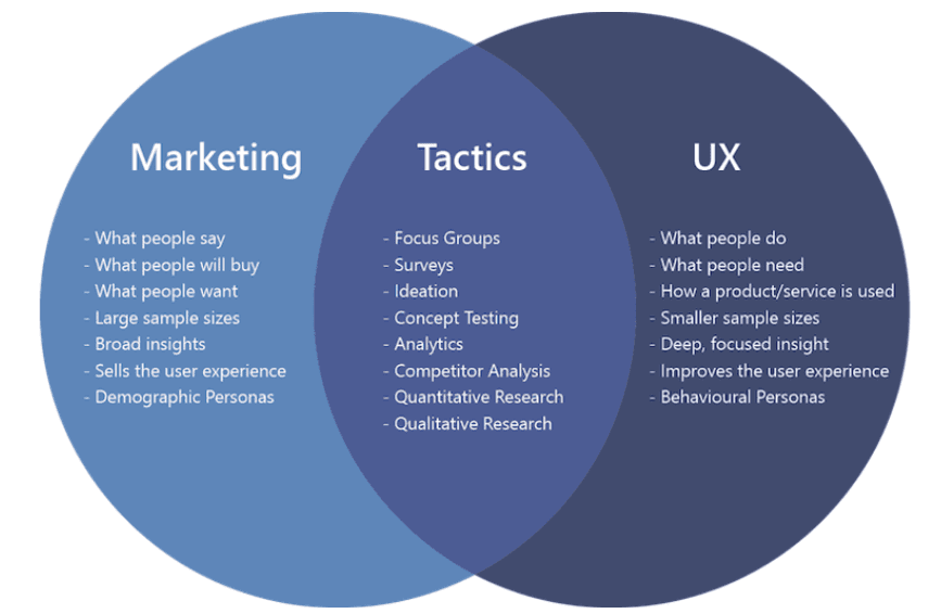
Click here to see the visuals I used to convey the concept of UX:
View Presentation
Subscription Manager Flow Alteration (SRNG3)
Changing how we handled our subscription manager features had a ripple effect across the entire shopping platform, not just the management page itself.
To communicate the impact of these changes and justify expanding the project scope beyond the subscription manager page itself, I created a flow diagram that visually demonstrated how the user flow was affected and why broader updates were necessary.
Click here to see the full concept breakdown:
View Slides

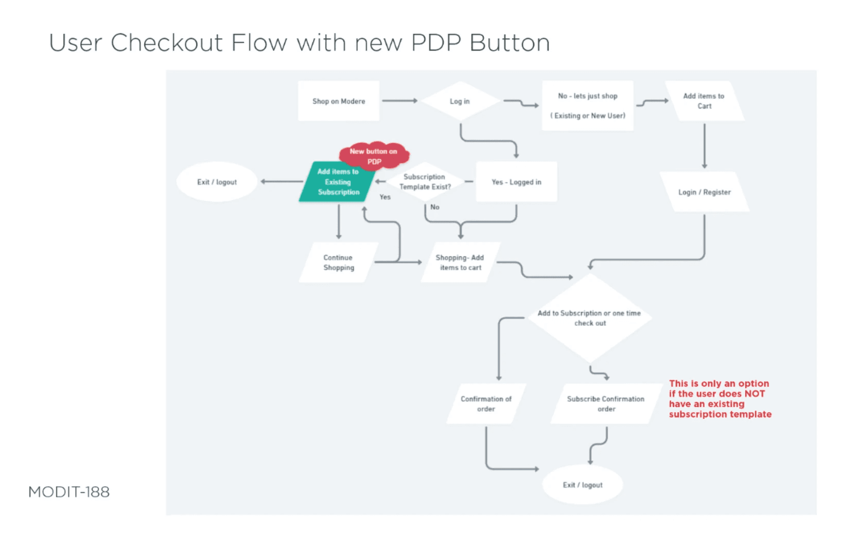
Conditional Guest Checkout User Flow
The guest checkout flow involved minimal UI changes and presented a simple front end experience, which made it challenging to communicate the full scope and complexity of the project through design mockups alone.
Many of the key differences were behind the scenes, dependent on conditional logic, account status, and user actions that weren’t visually apparent in the interface.
To bridge this gap, I created a detailed flowchart that mapped out the decision tree, showing how users would navigate between different experiences based on various scenarios.
This visual aid was especially valuable in helping both the team and stakeholders understand the branching logic and underlying functionality, clarifying a process that otherwise appeared deceptively simple in the prototype.
Click here to see the project designs:
View Slides
Subscription Program (SocR 2.0)
While revising Modere’s subscription program, one of the major challenges was helping users clearly understand how they qualified for different benefits.
The rules were layered and often confusing, so I created a series of visuals that broke down the logic in a simple, digestible way.
One of these visuals, shown below, helped communicate the qualifications more effectively to both internal teams and users, making the program easier to understand and reducing support inquiries.

Click here to see documentation from the project:
View Documentation
Click here to go to the portfolio piece for the work I did on how this project evolved:
Subscription Programs
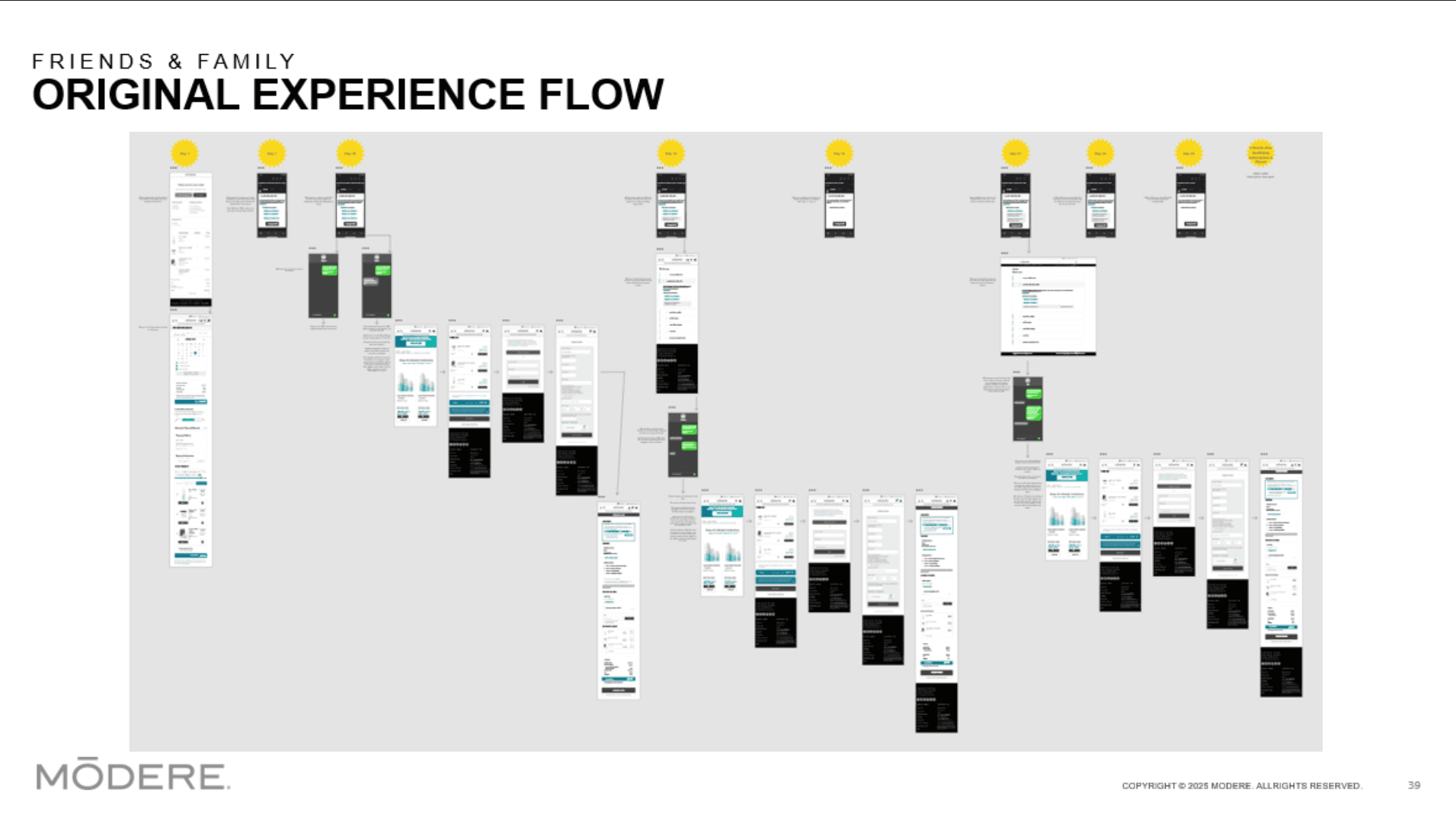
Another key component of the program was the Friends & Family benefit, which allowed customers to share discount links or codes with people they knew. If a code was used, the recipient received a discount and the referring customer earned shopping credits.
Initially, the business planned to limit each customer to three shareable links. However, user research quickly revealed major flaws in this approach. Users didn’t want to choose just three friends; they wanted to share the benefit broadly.
This restriction led to confusion and frustration when codes were reused or no longer valid. It also introduced ambiguity around where to enter the Friends & Family code versus a referral code from a Modere direct seller, which could affect commissions.
To clarify the issue and build a case for change, I created a visual diagram that mapped out the user journey and highlighted points of confusion. This helped stakeholders clearly see the risks of the original plan and provided a strong foundation for redesigning the experience to better meet user expectations.